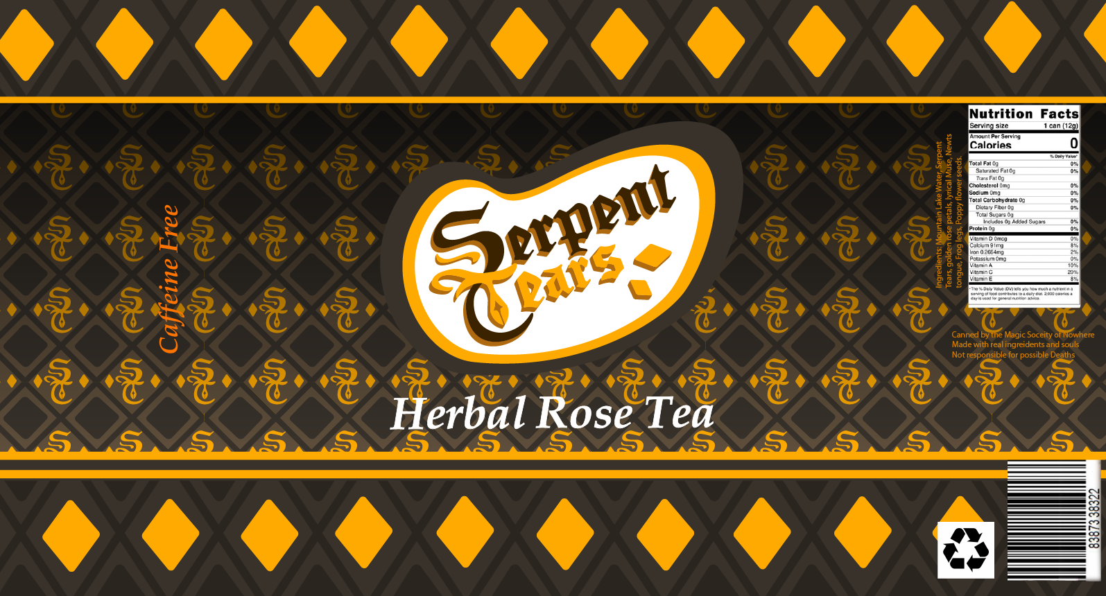


Serpent Tears was a beverage campaign project that had many design revisions. One of the drinks I decided to pick for this project was herbal rose tea, since I wanted create a snake and rose themed brand, using the colors orange and yellow. I had to look up the different types of snake’s scales for this project to ensure that I got the correct ‘serpent’ that I wanted to illustrate, as I didn’t want to make a viper by accident. I took some time to play around with the logo design and created interesting patterns that can be used on merch, such as clothing or bags. The can design took the longest to figure out how I wanted to look like, since I had too many ideas to play with and couldn’t decided which one fit my brand the most.


One of the most challenging parts of this project was the fact that I struggled with the design of the Can Design. There were too many concepts, ideas, and themes that I wanted to go for the brand. However, the remaining factor that survived for the project is the relation with snakes, roses, and the colors orange, green, and brown. I was mainly focused on a male target audience for this project.