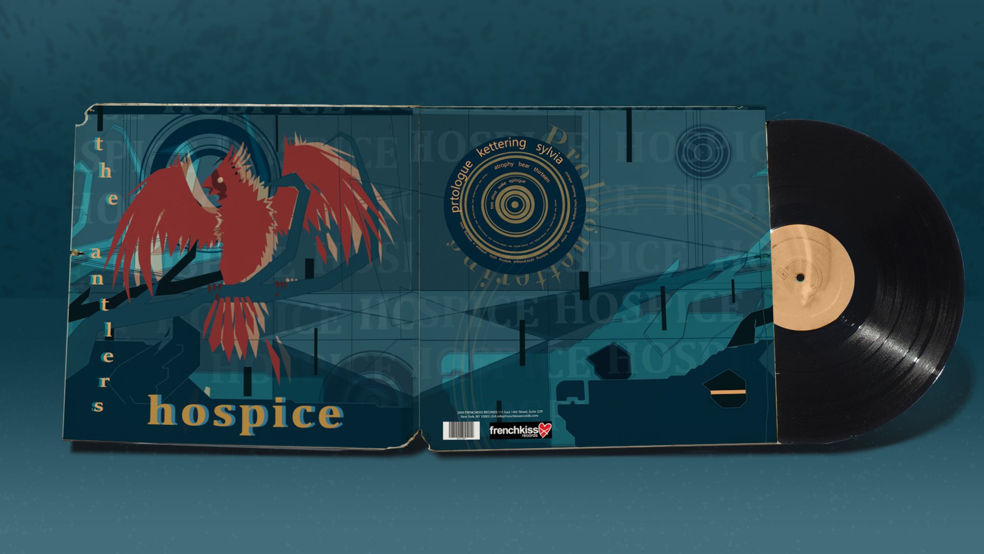

Album Cover: Hopsice by Antlers
This album cover project was inspired by The Antlers' "Hospice" album, wce" album, which has a deep meaning hidden within the verses. I decided to go for the Swiss Style's International Typographic version, which focuses on cleanliness, precision, and simplicity.


Meanwhile, the deer is often portrayed as a guardian of the forest or the purity of nature. The cardinal representing the 'love' in this situation, shows the selfishness of a soul that is bright and colorful compared to the world it views itself in. Even seeing the deer as being something in the background, but only wants its attention to itself. The deer continues to carry the cardinal, enraptured by its bright colors deafening its sharp calls and tattered wings. The deer's eyes are shut and have turned away from the truth. Only lending its strength and ear towards the cardinal, for it gives the deer a sense of purpose in a blue world. Interestingly, there is a chance that this design will have a different interpretation to those who view it, as The Antlers' album does for different people who have listened to its lyrics.


